Story highlights
The Galaxy Nexus was born from a collaboration between Google and Samsung
It's the first phone with the latest version of Android, called Ice Cream Sandwich
The U.S. version for Verizon Wireless does not work with Google Wallet
The Galaxy Nexus, a smartphone that arrived in Verizon Wireless stores on Thursday, is huge – and not just because of its unusually large size.
The new Android phone, which has been available in Britain for weeks, is the first to run Android 4.0, the latest version of the popular mobile operating system that also goes by the adorable name Ice Cream Sandwich. This is a very significant update to Android for smartphones.
Gadget Review: Galaxy Nexus from Google and Samsung
Features: Large 4.65-inch curved touchscreen, Android 4.0, NFC chip, Verizon Wireless 4G LTE
Price: $300
Our Verdict: One size, especially gigantic, does not fit all, but Android 4.0 is a polished operating system with features for newbies and technical pros.
I’ve tested the UK version of the Galaxy Nexus for about a week. It looks and functions about the same as the one for Verizon, except that the U.S. model uses different cellular chips to accommodate Verizon’s legacy infrastructure and its fourth-generation LTE data network. The U.S. version also does not run Google Wallet, the mobile payment system. The phone costs $300 with a two-year service contract.
The Galaxy Nexus’ operating system takes many of the concepts that were designed for Android tablets, shrinks them and unlocks their great potential to an audience that will likely be much larger. Android tablets have not fared particularly well in the market, which means that this interface will look fresh to most people. (Amazon’s Kindle Fire, which analysts say has sold well at $199, is a tablet based on Android but looks completely different.)
Fewer buttons
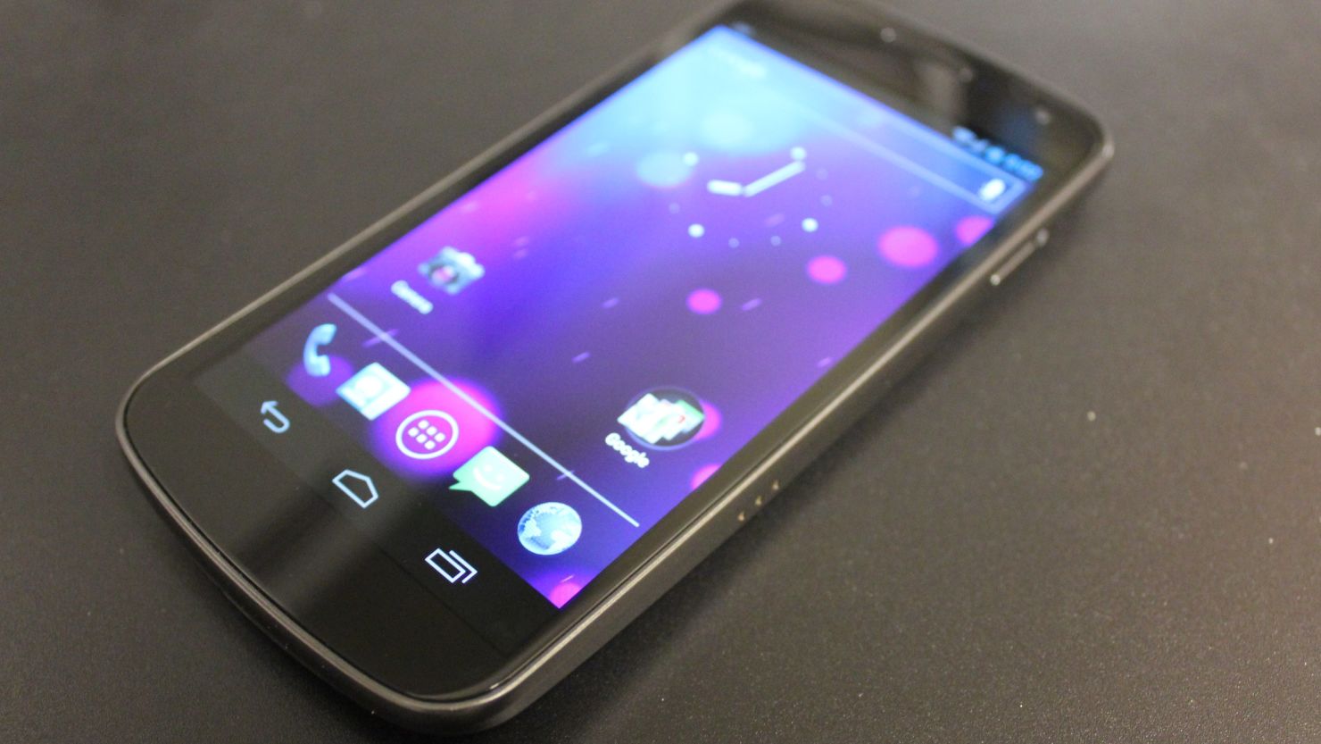
Perhaps the most significant change to the software is that Google has done away with the hardware buttons below the screen. These have become touchscreen buttons, which aren’t all that different, but the direction they face flips depending on which way I’m holding the phone. It’s a nice touch.
Now, there are only three onscreen buttons, instead of the usual four. These are used for returning to the previous menu, going to the home screen or viewing which apps are currently open.
But many older Android apps will stick a button, which looks like ellipses printed in Hebrew, on the end of those touchscreen buttons. It handles miscellaneous actions. Developers are expected to update future versions of their apps to remove this button and instead incorporate those functions somewhere onscreen. In complex programs, like the Web browser or the app market, Google puts the everything-else button on the top bar. When moving quickly between old and new apps, I found myself losing track of where to look for extra functions.
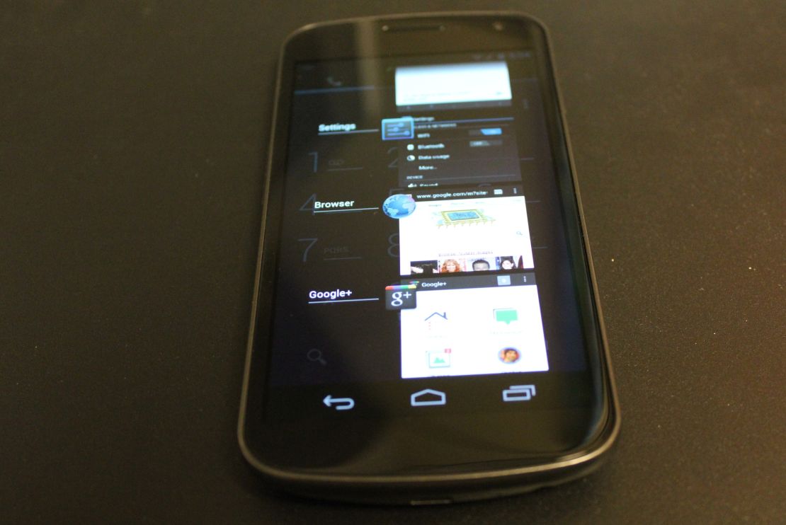
The dedicated multitasking button, in place of the search button, is a welcome addition. In previous versions a list of open apps could be activated by holding down the home button, but newcomers to the system had no idea it was there. Rather than showing six icons, the button pulls up a list with snapshots of each program as they were when I left them. These pictures are generally too small to be useful, unlike on Android tablets where this provides a handy visual cue.
Android 4.0
The Galaxy Nexus hardware is born from a collaboration between Google and Samsung. Much of the new operating system has gotten a thick coat of polish.
In the apps menu, the buttons tilt slightly to denote when I’ve encountered the end of the list. As I flip through, one page slides away as another smoothly pops into view. When cleaning up the notifications list, each line slides out separately like Jenga pieces. Turn off the screen, and it fades to black with a flicker of white in the middle, like a 1960s television set.
These aesthetic pleasantries are sprinkled throughout Apple’s competing iOS, like the icons dancing when they’re ready to be rearranged, but this type of elegance has been less common in Android. The subtle changes make Google’s software seem friendlier, in contrast to the sharp, weapon-like Droid from before.
Despite its historical roughness, Android found a huge audience among people who were not eager to take on the expenses associated with the iPhone. Now that Apple has cut the prices on its phones and found a home at three of the four largest U.S. operators, Android is making itself more accessible, and not a moment too soon.
The phone and contact list apps in Android 4.0 automatically create groups of frequently-contacted people to accompany the favorites feature. Those apps look like miniature social networks, with detailed profiles and big pictures of friends.
Apps and features
Yet there remain many tools for gearheads. Some of these are perhaps so “in your face” that they may deter less advanced users. A widget for toggling the phone’s various sensors, like Bluetooth and Wi-Fi, is situated on one of the home screens. The icons may be familiar to pros, but my mom would not be able to identify each of the five or know what to use them for.
The widgets can, of course, be ignored, but users should eventually take the time to learn them. These little doodads, which can be dragged to the various home screens, are more robust and customizable in Android 4.0. They are also easier to find, nestled right next to the list of apps installed on the phone.
A new Data Usage monitor in the settings menu is a data lover’s or cheapskate’s new best friend. It presents detailed graphs about how many bytes the phone is sucking down from the cell network, separated by individual apps. It lets users manage their monthly caps in a very geeky, useful way. However, the app crashed several times during my week of testing.
Some of the other power-user options are overcomplicated.
For example, the main screen contains three separate apps that many would assume do the same thing: Messenger, Messaging and Talk, all of which have chat-bubble icons. The first is for group chats using the Google+ social network; the second is for text messaging through cell networks; and the third is for instant messaging through Google’s network.
This sort of hyper-option syndrome extends to smiley faces. The new Android has a detailed directory of smileys. I’m not sure if this is designed for power users looking for just the right trio of characters to express their precise emotions or as a reference guide for moms.
Either way, I learned some new things: Specifically, that :-| means “poker face,” that :-! means “foot in mouth,” and that :-$ means “money mouth.” Whatever that means.
Sturdy, but too big?
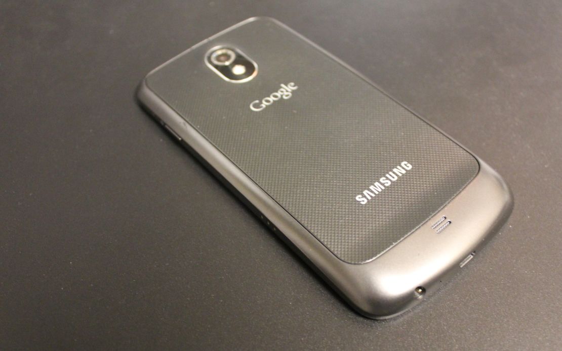
Despite the new cuddly Android features, the phone looks like a tool of the military. The back looks like a metal grate, although it’s actually plastic. It comes off to allow me to easily change the battery, but it doesn’t snap on very easily. Still, it’s nice that I can switch out the battery, unlike the iPhone.
The Galaxy Nexus does have plenty of curves, including the screen itself, which Google says is done to fit the contour of a face when making a call. But at 4.65 inches diagonally, the screen feels a little silly when pressed against my ear.
Because the screen is so gigantic, I had some difficulty operating it with one hand, struggling to stretch my thumb from one corner to switch apps and back to the other corner to compose an e-mail. Typing requires more dexterity because my thumbs have to travel farther between keys. But YouTube videos and Netflix movies look fantastic on the big display.
Phone calls are crisp, and the speaker phone is fairly loud. Battery life is adequate in normal usage, but I did not test the Verizon version on the faster, LTE network. Likely, battery life will suffer as a tradeoff for that speed. The GPS navigator that has been in past versions of Android is still free and still great, but battery life is abysmal, at about three hours. Bring a car charger.
The sheer size of the Galaxy Nexus puts me off, but the hardware and companion software is sturdy and impressive. When other manufacturers adopt Android 4.0, I expect to see some very compelling phones, though I do wonder how well the new version, without hardware buttons, would work on a smaller screen. We will find out soon enough.
The Galaxy Nexus provides a clear view of the next generation of powerful Android phones, and I look forward to seeing what comes next.